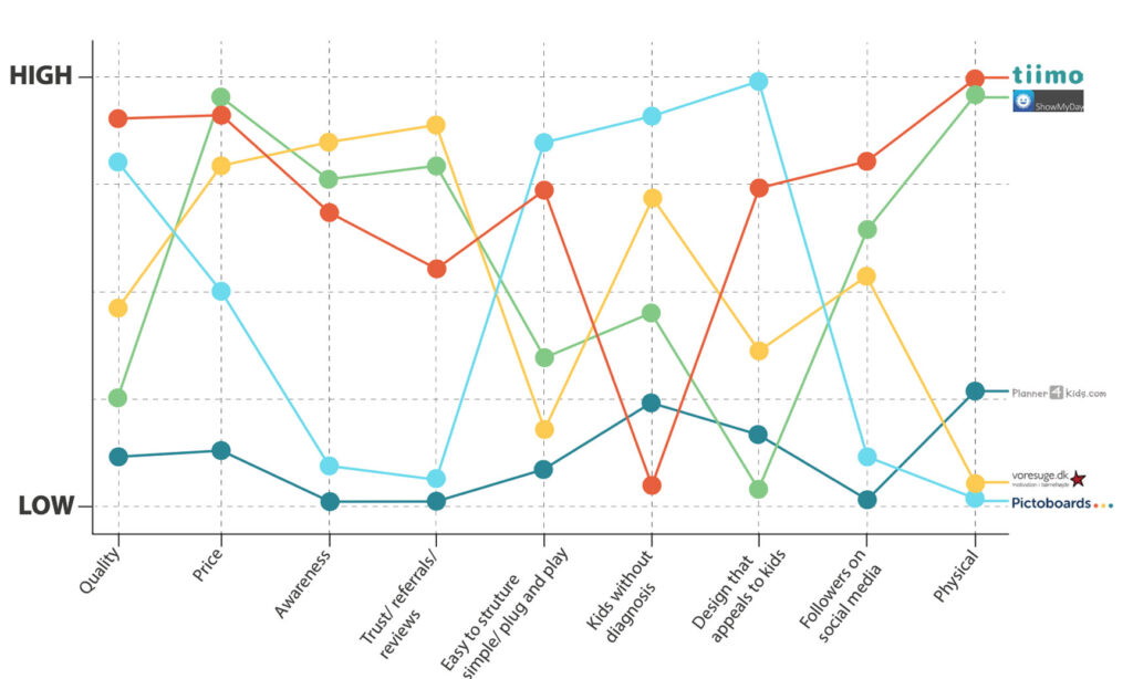
Pictoboards

Branding consultant and content designer

CAMPAIGN FOR PICTOBOARDS

I joined Pictoboards in the end of post production. Meaning they already made the visual identity (icons and illustrations) and webshop but needed a business strategy as well as finding out how to create brand awareness. My first task was to make a very detailed report with internal and external analysis about Pictoboards and the market . All of the research and analysis was leading to a creative brief which was used as the foundation of a marketing campaign. Before delivering the final campaign I made a presentation for the CEO of Pictoboards.
Click here to see the presentation.

Title

Blue ocean strategy

We needed to identify what resources Pictoboards have to differentiate themselves from their competitors which is why we used a Blue Ocean Strategy Canvas comparing Pictoboards to its direct competitors.
We discovered that Pictoboards have a strong visual brand identity and a quality product and differentiate themself from the competitors by using a motivating and child-friendly design as well as focusing on kids without a diagnosis. But they were lacking in creating trust and awareness.
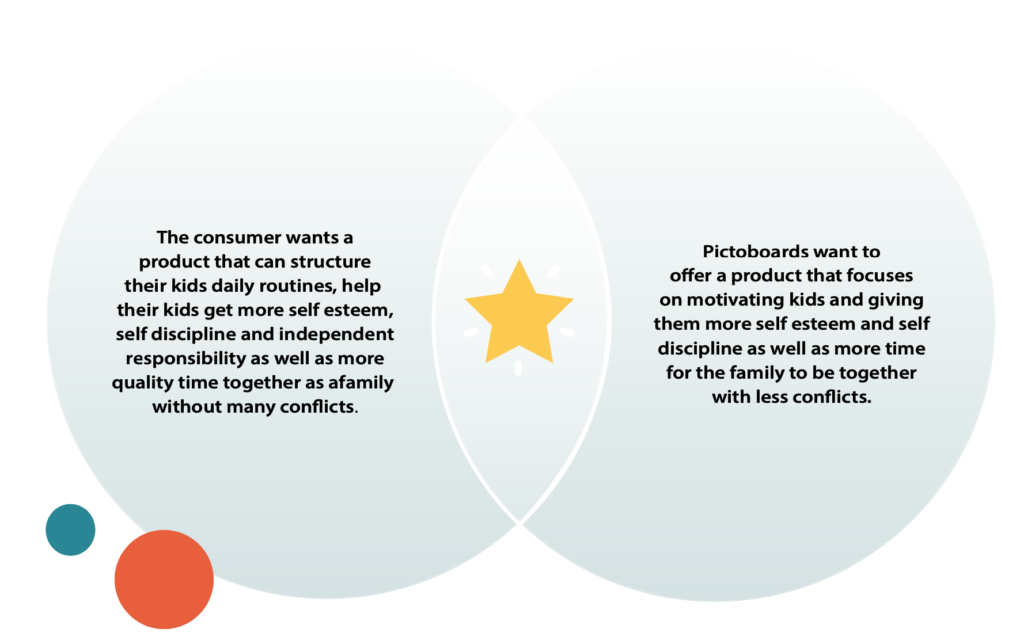
Title

SWEET SPOT

From the value proposition canvas we were able to find a sweet spot between what Pictoboards is capable of offering and what the target audience needs.
The consumer wants a product that can structure their kids daily routines, help their kids get more self esteem, self discipline and independent responsibility as well as more quality time together as a family without many conflicts.
Pictoboards wants to offer a product that focuses on motivating kids and giving them more self esteem and self discipline as well as more time for the family to be together with less conflicts.

Title

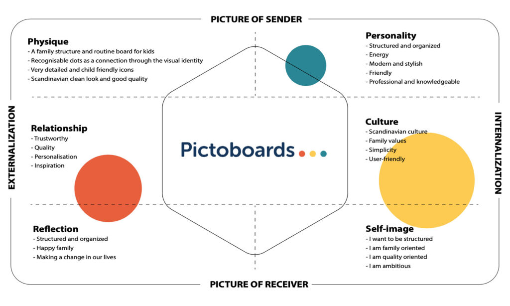
Brand Identity prism

The Brand Identity Prism is a way for a brand to identify and transmit a precise imagery and a personal way of communicating with its target. The Brand Identity Prism helped us to sum up the internal analysis and to know how to present the brand in the campaign both looking at the communication and visuals.
As the company was still in post production we conducted a Brand Identity Prism with the CEOs view of her brand. After working with this company for over 2 years now I can say that their current identity fits the brand prism that I made in post production.

THe campaign site including campaign video

Scroll inside the iframe to see the whole site

Check out more online and offline content I have made for Pictoboards

Rebecca’s experiences with BIMO

I wanted a kids perspective of the product as it’s the kids that are using the product.
I chose Rebecca because she has a lot of charisma and with her 8 years old she fits right into the target group.
Her parents are busy and was looking to find more structure in their everyday life.

Campaign video

This is the video to create attention to the campaign site mentioned in the top.
As the campaign was built around conflicts and quality I wanted kids to talk about their view of these
subjects. I wanted to use an emotional selling point to make the parents feel
warm and happy looking at the the sweet and cute kids but also a
certain concern of how much the kids actually pay attention.

Interview with the CEO of Pictoboards introducing the Time Timer

Animation video for Christmas

Facebook and Instagram video (video in other format for Instagram) for a christmas ad.
When creating these videos for social media I am charge of everything from creating the concept,
communication, creating the videos and finded the best wat to target the right audiende.
This specific video is targeted busy families during christmas time who just want a less stressful and more joyful christmas.

Animated introduction video to BIMO and Pictoboards

I needed to find a way to present Pictoboards product to the target group. I made an animation video
that in a very simple way shows how BIMO (Pictoboards motivational board) works.
I also made a couple of videos of the CEO talking about Pictoboards and its products.

Online and offline posters, social media content, flyer and ads

Websites

I have also worked a bit on their main website as well as creating an international landingpage.
https://pictoboards.dk/forhandler/ & https://pictoboards.dk/anbefalinger/

INstagram

I am now in charge of Pictoboards Instagram. Creating content that is engaging the audience, building and promoting
our instagram shop, schedule posts for at least 3-5 times a week and building the wall in a way that is attracting
to the target groups eyes and making sure that Pictoboards brand image and identitet is easy to spot.
Every month I make a mockup of what and how we to post to Instagram for the month. Doing a mockup makes it easier to
make the wall look visually attracted as well as getting a better overview of the content added for the month.
I like to make themes for every 3rd pictures making a page that is connected and had visually attracted themes for every single week.
The colors are very important and on Instagram we are using a lighter blue compared to Facebook and the websites where we are using a darker blue.
This is because we don’t want the Instagram profile to look too corporate and want a place to really engage with the audience and a use
a less corporate communication.